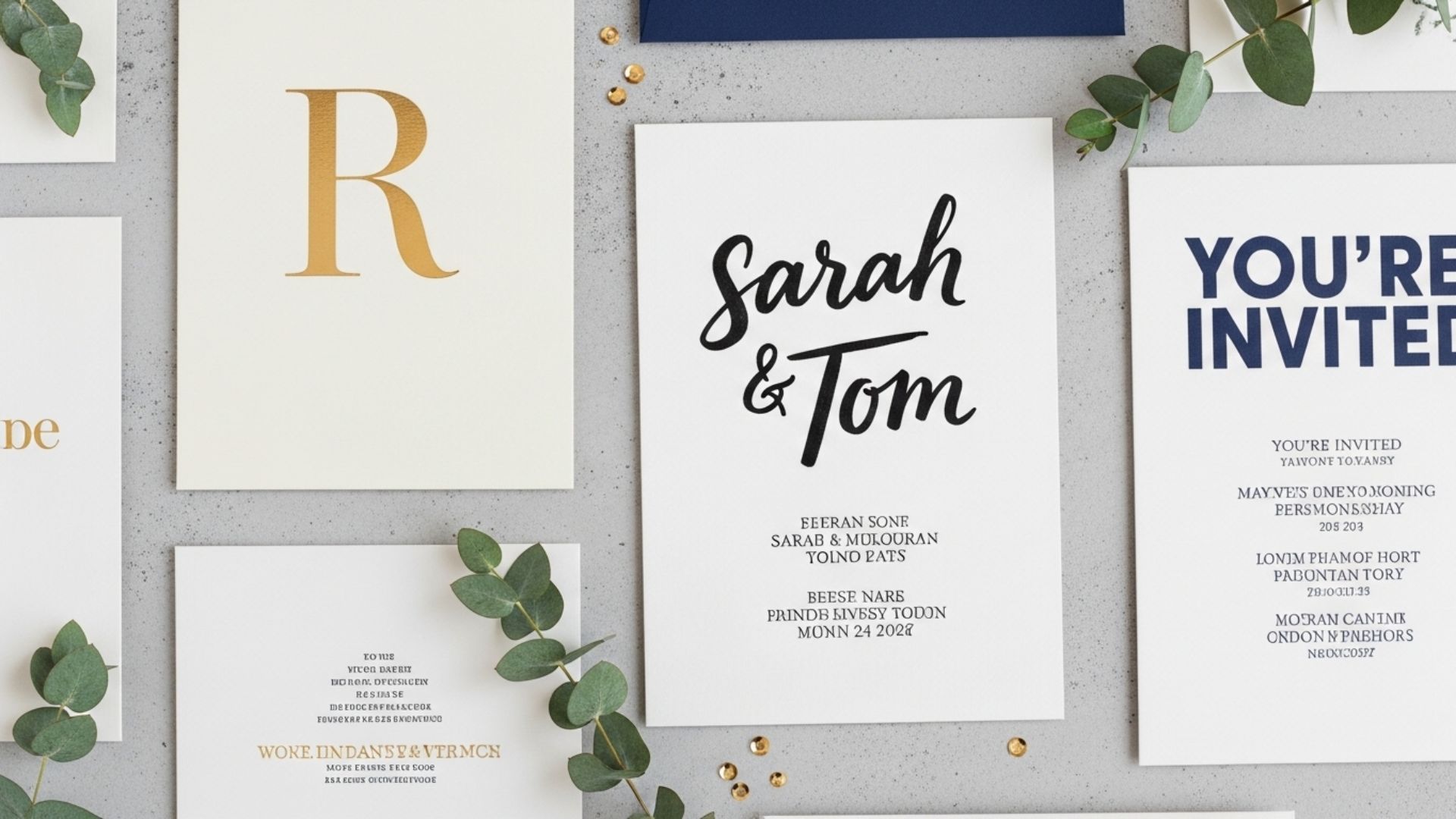
The moment someone opens an invitation, they form an instant impression of the event. Is it formal, fun, modern, or traditional? Typography plays a huge role in shaping that perception. While soft scripts and elegant serifs have their place, bold typography has become an increasingly popular design choice for those looking to create impact right away. Used correctly, bold type doesn’t just catch the eye it sets the tone for the entire celebration.
Why Bold Typography Works
Bold fonts command attention. They help highlight the most important details, such as names, dates, or themes, and create a visual hierarchy that makes the design easy to follow. Whether you’re going for a dramatic, stylish look or something modern and minimal, bold typography gives your invitation the ability to stand out in a stack of mail or a crowded inbox. With today’s design tools, you can even explore creative options for invitation printing to set yourself apart, ensuring that your final product looks just as striking on paper as it does on screen.
Tips for Using Bold Typography Effectively
- Highlight Key Elements: Reserve bold fonts for names, event titles, or dates. This ensures that the most important information draws immediate attention.
- Pair with Simpler Fonts: Bold typography is powerful, but it needs balance. Use a clean sans serif or a classic serif for body text to keep the overall design readable and polished.
- Play with Scale: Sometimes, it’s not just about weight but also size. Enlarging a bold word or phrase can create a dynamic focal point without overwhelming the design.
- Use Color Wisely: Bold fonts don’t always need to be black. Pairing bold typography with subtle colors like navy, burgundy, or even metallic tones can elevate the look and feel of your invitation.
Common Mistakes to Avoid
- Overusing Bold Fonts: If everything is bold, nothing stands out. Use restraint so the bold elements have real impact.
- Ignoring Readability: Some decorative bold fonts look appealing at first glance but become hard to read in longer text. Always test your design.
- Clashing Styles: Mixing bold scripts with equally heavy display fonts can create visual tension. Aim for balance instead of competition.
Real-Life Inspiration
A recent bridal shower invitation I came across used oversized bold typography for the bride’s name, paired with a soft sans serif for the event details. It felt modern, chic, and unforgettable. On the other hand, I once saw a birthday invite where nearly every word was in bold, leaving guests squinting through a wall of text. It proved that sometimes, less really is more.
Final Thoughts
Bold typography can transform your invitations into powerful design statements. When used with intention and balance, it not only captures attention but also communicates the spirit of your event before guests even read the details. By highlighting what matters most and keeping the rest clean and simple, you’ll create invitations that are both stylish and memorable.

